 Let's talk ↗
Information Design
Infographic Design
Project overview
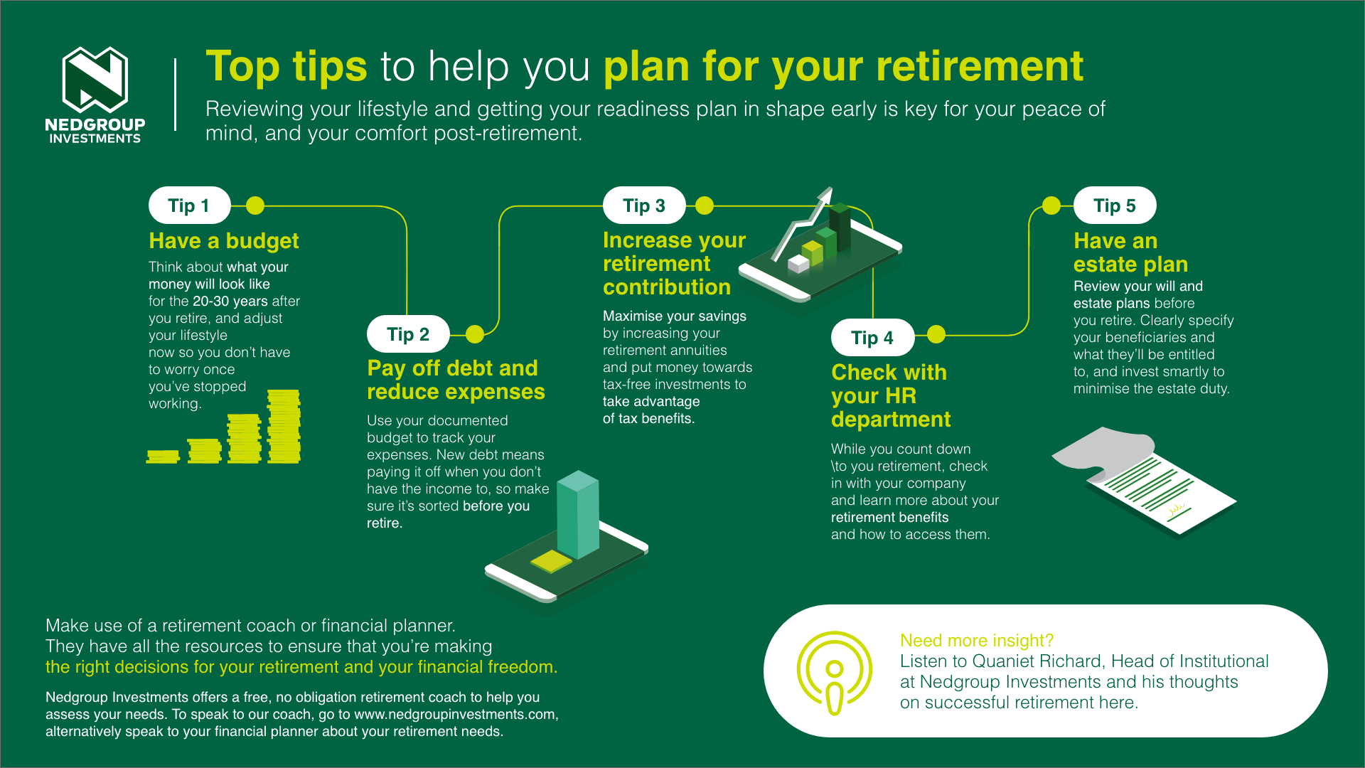
Turning retirement planning into five clear, connected actions.
Created during my time at Publicis Machine, the project began with a substantial body of client information designed to help people plan more confidently for retirement. I worked alongside a copywriter, who distilled that material into five core points and the supporting information needed to explain each one.
My role was to translate that content into a clear visual journey. I structured the five points, established hierarchy and flow, applied the Nedgroup Investments CI and visual language, and selected supporting illustrations from our stock library. The result guides the reader from one action to the next without allowing the content to feel dense or overwhelming.
Design philosophy
Clarity is the craft.
For me, a successful infographic is not the one with the most visual elements; it is the one that makes complex information feel effortless to understand. Every headline, illustration, connection and block of copy needs a clear purpose.
I favour clean layouts and deliberate negative space because space creates hierarchy, confidence and breathing room. Used well, simplicity can make practical information feel considered, luxurious and visually beautiful, while still allowing the message to do its job.